13 Apr
19
- Design --
- Functionality--
- Usability--
- Content--
- Score--
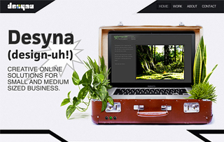
Desyna
The website is designed from a minimal vantage point with oversized fonts and elements to attract behavioural response. Subtle textures and repeating patterns are also used to enhance interest and hard, angular lines were added to create a sense of dimension. The ubiquitous slider creates a point of interest and helps showcase the work right from the initial impression.


